Figure 1
Logos are a vital tool for companies to promote and advertise their brand. They are the visual face of the brand and are sometimes the only way for the consumer to identify the brand over a competitor. To discover whether the public could spot brand values in logos, over one hundred people were asked to complete a survey comparing these brand attributes to specific logos. The results showed that the majority of people agreed with the brand attributes related to the logos. Research into the methods behind logo design was conducted revealing how designers placed meanings into logos via the choice of font or wording, the symbols used and the logo's general composition. This research was used to evaluate a selection of companies that have changed their logos; to see the reasons behind it and the differing messages they were trying to convey. The messages ranged from a change in target markets, to a change in product range or design features.
'The logo is the focal point of any identity system and the key to its acceptance'. (Evamy, 2007:7)
The importance of having an effective and recognisable logo is a major part of creating a strong brand identity for any organisation. Consumers build relationships with certain brands, described as a loyalty, which will often lead them to choose one brand over another. For example, if they are torn between two products, they may see the logo of a brand they trust and choose that product. Some logos that are used can often carry specific meanings that are inherent to the brand. This study will determine whether the public actually notice these meanings and make the desired associations with the brand.
It is important to fully define what a logo is and the terminology that goes alongside it. A logo is best described as a mark of identity that is easily recognisable. Most organisations have them in some way, shape or form, from worldwide multinational companies, right the way to schools and charities. A logo can be as simple as a symbol or the name of the company, or be a combination of the two. Logos are often referred to as logotypes or word marks. The word 'logo' came about through the shortening of the word logotype, which is described as the combination of words and symbols to create a unique mark (Figure 1).
Figure 1
Word marks are considered to be a type of logo that uses words but adds a typographical twist. An excellent example of a successful word mark is the logo for Shelter (Figure 2.). Shelter is an organisation that helps more than 170,000 people find and keep a home. Their logo changes the letter 'H' into the shape of a house, so helps to provide a message about the purpose of the organisation.

Figure 2
The aim of the study is to find out how companies and brands can utilise their logos and trademarks to provide the public with insights into the qualities that their brand can offer. The study also aims to provide an insight into the methods that are used to convey these methods and justify their effectiveness.
The study is structured into 6 main sections: literature review; methodology for research; case study; survey; discussion; and conclusions. Each section is broken down accordingly into smaller sections for ease of communication. A list of figures and tables can be found at the end of the study, along with a list of references and acknowledgements. An appendix accompanies the study, containing items such as a sample survey and the results of the survey.
To answer the research objectives, various literature sources have been consulted. The main area researched has been logos, with specific books such as Logo by Michael Evamy, a compilation of some of the greatest logos ever designed, and Masters of Design: Logo and Identity by Sean Adams. These have provided both an excellent reference for logos to analyse and also a fascinating insight into the thought processes that designers use when creating logos and brand identities.
Logo design and the messages they carry is heavily linked with branding and marketing. Books regarding 'laws of branding', methods for building a strong and successful brand, as well as reasons why brands fail have been thoroughly analysed. To maintain focus during the study, the research into branding has been specific to the use of the logo and what role it has to play.
The book Logo is an appreciation of the best logos and trademarks past and present. They have been ordered into categories according to the most significant visual features. In the introduction of this book Evamy presents his description of what logos are, where they come from, who designs them, what logos mean and where logos go. He also discusses briefly what logos can change and why logos change.
When describing exactly what a logo is Evamy states that 'It is the compression of meaning into just a few marks' (Evamy, 2007:7). By this, he means that the logo has to communicate certain brand qualities in a recognisable and memorable mark. If the company is trying to convey the message of being a fun, family business it may do something as simple as using a stylised and cartoon type font on the logo. This immediately makes a connection to the consumer.
This is an important point as it is very rare that consumers will, say, buy one product over another just because they like the logo. It is more likely that the consumer will buy a product from a certain brand because they know it's reliable, or it is of a high quality. He stresses that logos are but a small part of a 'bigger identity package', so the logo, the slogan, a possible name change and a corporate visual style will all go towards developing a unique identity. It is this unique identity that consumers buy into and build a relationship with.
When discussing what logos mean, Evamy states that 'Meaning is of little importance compared to the associations that customers make with the organisations as a result of their own dealings with them' (Evamy, 2007:15). By this he is talking more about using symbolism in the logo, for example, the LG logo (Figure 3.)
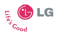
Figure 3
'LG claim that the “L” and “G” contained in a circle symbolise the World, Future, Youth, Humanity and Technology'. (Evamy, 2007:15) One might make those associations now that they have been explained but the consumer is highly unlikely to see this. This kind of 'semiotic bombast', as he refers to it, means he is very cynical towards the use of symbolism as he feels that it is used as a way to justify the high cost of the project to the shareholders 'Yes it was expensive...but look at how much symbolism we got!' (Evamy, 2007:15)
On the flip side of this, he also states that 'However, we do, as a species, feel the need to seek meaning in images. We like stories, and pictorial logos can provide that kind of fixed narrative'. He uses the example of the Lucent Technologies (Evamy, 2007:15) which unveiled a logo of a hand painted red eye designed by a director of Landor. The audience made the association to Lucifer so the symbol took on 'an air of diabolical menace.’
This book contains the thoughts and views of some of the most well respected and renowned logo and identity designers in the world. The writer, Sean Adams, himself a successful logo and identity designer, says in the introduction,
'The logo is a distillation of the client's most basic communication, “This is who I am.” The visual system answers the question, “This is what I believe.” The combination of the two, as offered in this paper, by twenty seven of the world's masters of design, creates a message that is exciting, clear, and potent' (Adams, 2008:7). The views of respected and well renowned logo designers perhaps give the best insight into messages and meanings behind logos. Although they all have different methods for logo and identity design, and often a hugely varied style, they all seem to agree on the fact that to design a successful logo, there needs to be clear message behind it.
All the designers in the book concede that the logo is always part of the bigger picture. They often don't just design a logo for a company; they design a whole identity which is part of a visual system such as letterheads, leaflets, websites and business cards. The combination of the logo and the identity goes towards developing a brand identity and personality. It is important to remember that logos do not work on their own, but in tandem with the branding system. A company could have the greatest logo ever designed, but it won't save a bad company. The logo works to enhance a good company and consumers in turn will associate good brand qualities when they see that logo.
In this book the author also talks about some of the trends that are associated with logo design for various business areas. Take the restaurant and hospitality area, the messages that they need to try and get across to the customer are more to do with the atmosphere that they can create, not corporate values. Matteo Bologna, a designer featured in the paper who has designed many logos for successful restaurants, uses historical idioms to communicate the personality of the company. The logo will help to immerse the customer into a certain time or place through the historical references, thus creating a theatrical experience of dining. So when the customer sees the logo, the main message they receive is all about what they are going to experience. Another issue that this book talks about is the changing of logos. Designers strive to design something that will stand the test of time and become regarded as 'classic'. This is why some logo designers avoid using production techniques that can time stamp work, such as using digital effects. Michael Johnson from Johnson Banks says 'I think the prevalence of three-dimensional logos now will look very early twenty-first century' (Adams, 2008:117).
He also reveals that he has found there is a faster turnover for logos, which is obviously good for his business, but also shows that 'identity design can be more now and less classic' (Adams, 2008:117). This is a possible indicator that businesses are trying to keep up with modern trends by reinventing themselves to avoid becoming stale and predictable.
This book talks about the theories and principles behind branding strategy and how to apply them to a business or organisation. The book touches upon logos and how to deal with them in a branding sense. One section talks about the law of shape which is specific to brands logo. The main point that is made is about how the customer will see a logo and how this should affect the overall shape of it.
'A customer sees the world through two horizontally mounted eyes, it's like looking out of an automobiles windscreen...for maximum visual impact, a logotype should have the same shape as a windshield'. The book also discusses whether elaborate logos and shapes are necessary. It argues that the logo carries no meaning and that it is all carried in the words. It uses Nike as an example.
It's the name Nike that gives meaning to the Swoosh symbol. The Swoosh symbol doesn't give much meaning to the Nike brand. After a symbol has been associated with a name for a long period of time, the symbol can represent the name. But it's still the name that carries the brand' (Ries and Ries 2003:131-132). The point being made is that when a company first produces a logo, the name of the company defines the logo, but after a period of time when the customers have built up a relationship with that brand, the logo can represent the name of the company.
In this book the author gives examples of how and why certain brands fail through a series of case studies One example of a brand failure documented in the book is Hilfiger (Ries and Ries 2003:170-173). Tommy Hilfiger is one of the world's most recognisable premium lifestyle brands, but had a bit of an identity crisis in the late 90's.
When profits plateaued in 1999 the company thought customers didn't want the logo. They believed that they had to become more chic like the European fashion brands such as Gucci and Prada. This was a mistake as they had become famous for their logo. The simple red, white and blue logo was seen in just about every rap music video in the 90's, so their decision to make the logo smaller, and even remove it, meant that customers were losing an association with the brand. 'The logo is what made Tommy Hilfiger the brand it is today. In fact, the Tommy Hilfiger brand is pure logo. When the logo disappeared or was toned down, the brand ran into trouble'. (Haig, 2003)
This book talks about branding and how to effectively create your own brand. As with the '22 immutable laws of branding book', Frankel says that the logo is not the brand. 'Some people think that you can just slap a logo on to anything and consider it a branded...That's not branding, it's bad marketing' (Frankel, 2000:115). He also has 4 pointers for a logo (Frankel, 2000:116)
The information given about logos is far more brand orientated than the other books. It's worth considering that point two is about the logos is the 'logo effectively communicating those brand attributes.' So, again, the point is made that logos have to carry some sort of message about the brand for them to be successful, and, in turn, make the brand successful.
Most of the information gained from the literature review has been very consistent and most of the books haven't conflicted in their ideas on 'the logo'. They all agree that logos need to carry messages about either the brand attributes or what the organisation does. Some are more insistent about this than others though. The book on branding consider the logo to be of less importance than the designers do, but this is to be expected. The designers will understandably feel that the logo is of high importance to an organisation, as it is their job, but they also realise that the logo has to work with the brand for it to succeed and ultimately it becomes part of a bigger picture.
To answer some of the research questions, both a case study and a survey, will have to be performed. The case study will look into a selection of companies that have felt the need to change or modify their logo. This will hopefully give an indication of why companies change their logo, and more importantly, discover whether they do this because they feel they need to convey a different message to the consumers. The survey's objective is intended to find out whether the public can pick up on the messages that companies try to convey to them through the medium of their logo.
The case study is an obvious selection for gathering data and information about the past of various companies. It gives the required scope to find out the reasons behind the changes that the companies have made, and compare this to events in their history. The survey is the best way to ask a large number of people their opinions on certain attributes of the companies in relation to their logo. By producing an online survey, a large number of people will be exposed to the survey and be able to fill it out quickly.
The companies chosen for the case study are Apple, Pepsi and BT. They have been chosen because they have been through three or more logos in their time. They all offer different services or products and are all aimed at different markets. It means that they are all trying to give different messages to the public and obviously this message may change, or they may find a more effective way to communicate it.
The survey is administered online, so the participants access it on the internet and fill it out. The results are accessible straight away online and can be easily transferred into analytical software. The survey consists of six questions. The first question is concerned with the age of the participant and could be used to try and identify a correlation between certain views and age. The other five questions are all centred on a collection of logos and ask the participant to choose how well they feel certain attributes match the logos of the companies. The participant has to choose between the following options for each attribute.
The method of letting the participant choose how well they feel the attributes match is the best way for them to accurately express their view, and for this information to be gathered and synthesised properly. It gives them scope and covers all the feelings that they may have towards an attribute. Each logo and options are displayed on a separate page to avoid confusion for the participant.
Pepsi has been chosen as it is one of the logos used in the case study. The attribute that have been chosen are cool, inspiring, trendsetting and fashionable. These are some of the brand values that Pepsi choose to promote.
BT has been chosen as it is one of the logos used in the case study. The attributes chosen are some of their brand values, but they feel that they are represented well in the logo. These qualities are trustworthy, inspiring, straight forward and helpful. ('The historical development of BT', n.d.)
Again, Apple is part of the case study so needs to be included in the survey. The attributes chosen are brand values and qualities. These are innovative, savvy, simplicity and quality.
The Kleenex logo has been chosen as it presents its brand values and attributes very clearly in the logo, and will hopefully contrast well with other logos in the survey, such as BT, who want their logo to represent more complex attributes. The attributes chosen for the survey are uplifting, approachable, friendly and family (Adams, 2008:28).
The Shelter logo has been included because as a charity, they have to present and express their brand values and attributes clearly and instantly, so that people can understand them and ultimately support them or utilise their services. The attributes chosen are qualities that the designer wanted the logo to represent. These are approachable, serious, honest and goal orientated (Adams, 2008: 114-115).
This case study has been designed to discover the reasons why organisations choose to redesign or change their logos. The companies that have been chosen have all been through three or more logo designs over their life. The companies chosen are Apple, Pepsi and BT.
Apple Inc is an American corporation that specialises in designing and manufacturing consumer electronics and software products. They are famous for their home computer products such as the iMac and Powerbook, as well as more recently, the iPod and iPhone. Apple, or Apple Computer Inc as they were known as for the first 30 years, was founded in 1976 in California by Steve Job, Steve Wozniak and Ronald Wayne (Linzymayer, 1999). The initial logo used by the company was a gothic style drawing of Isaac Newton sitting underneath an apple tree, surrounded by the words Apple Computer Co (Figure 4)
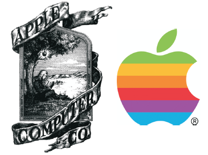
Figure 4
This gave the company a very elegant and sophisticated feel, and by using the depiction of the apple falling on Isaac Newton's head, they suggest an air of intelligence. This logo wasn't used for very long and subsequently was replaced by the now famous apple symbol. The reason for the change was due to Steve Job's needing a logo that could be reproduced more clearly. The Apple symbol was designed by Rob Janoff in 1977 (Figure 4). Originally the apple was whole, without the bite taken out of it, but the designer felt that it looked too much like a cherry tomato. By taking a bite from the side it added both a sense of scale to the image, and was seen as a play on the word 'byte'. The rainbow colours were at the request of Steve Jobs who wanted to advertise the colour screen of the Apple II (Evamy, 2007:259).
The logo didn't change again until 1999 when the stripes were taken off just leaving the shape (Figure 5. left). This was maybe seen as a way for the company to move to more minimalist products. The products that followed post 1999 were significantly the iPod and the new MacBooks. Both these products have a very clean, unfussy design and don't really include any design features that aren't needed.
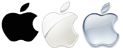
Figure 5
In 2001, Apple introduced a chrome silver effect on their logo (Figure 5. middle), to be used on their software, most notably Panther OSX, the Mac operating system. "(The new logo) is completely consistent with their design scheme," said Kasper Jade, Editor in Chief of AppleInsider, which was one of the first to spot the new silver logo. "Apple gets onto these kicks, and right now it's aluminium," Jade added. "It's a lot to do with Steve Jobs. He loves that aluminium." (Kahney, 2003)
The Apple logo was to change once again in 2007 (Figure 5. right) into the current logo, which is the same apple symbol, but with a different effect to render it. This time it is a brushed aluminium effect which, again could be attributed to design features present on some of their products, notably on the iPod range (Linzymayer, 1999).
The Apple logo seems to be a strong vehicle for the company to express design features and information about some of their products to the customers. The first Apple symbol helped to advertise the colour screen of the Apple II computer, the minimalist approach to products is embodied in the silhouette logo from the 90's, right up to the current metallic look which is feature of the products.
Pepsi is a soft drink produced by PepsiCo which is enjoyed worldwide. The drink was invented in 1898 by Caleb Bradham in New Bern, North Carolina. At this point the drink was called 'Brads Drink' and he intended it to be a delicious fountain drink created to aid in digestion. In 1903 the drink was renamed, and subsequently branded Pepsi- Cola. The original logo (Figure 6.) was said to be drawn by a neighbour of Mr Bradham but there was no indication it was used at this point. It would, however, be a starting point for the many logos' incarnations to come ('Pepsi can gallery', 2009).
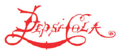
Figure 6
In 1905 Pepsi was first sold in bottles. From bottling and franchising to advertising, Pepsi-Cola continued to refine itself through processes and messaging. The logo was updated (Figure 7. left) to help spread the joy of Pepsi- Cola and expand the Pepsi brand ('Pepsi can gallery', 2009).
Only a year later, an updated Pepsi-Cola logo was registered (Figure 7. middle), this time the typeface was made bolder, and the word 'drink' added. As Pepsi increased in popularity, so did its advertising. Promotions, thematic advertising and other incentives included the slogan “I'll cool you.” While the company's logo changed again, Pepsi-Cola began to develop a consistent image and message ('Pepsi can gallery', 2009).
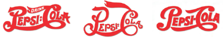
Figure 7
The next change in the logo came in 1939 (Figure 7. right). In this period of time, Pepsi-Cola was very much considered an economic drink; it could be bought for a nickel up until the Second World War. The changes to the logo were minor with the word 'drink' being dropped ('Pepsi can gallery', 2009). In 1951, a post war world got an upbeat lift by Pepsi-Cola in the form of new bottles, eyecatching ads and the “More Bounce to the Ounce” slogan. As times changed and consumer demand shifted, Pepsi shed its image as an economy drink and staked its claim as “The Light Refreshment”. The change in the logo helped to define this message. By dropping the elaborate nature of the typeface they effectively made a 'lighter' logo ('Pepsi can gallery', 2009).
Ten years passed before a major overhaul of the whole brand occurred. In 1962, millions of people identified themselves as a part of the “The Pepsi Generation.” Pepsi encouraged consumers to “Think Young” and part of this was to modify the logo, abandoning the traditional script for a more contemporary logo in 1963 (Figure 8. left). This new logo saw the introduction of the red and blue waves which would become a reoccurring theme from then on for all the coming logo iterations ('Pepsi can gallery', 2009).
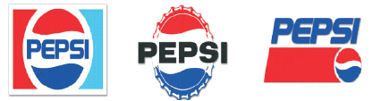
Figure 8
Throughout the 1980's, Pepsi ushered in a new generation with the help of some of the world's most famous actors and recording artists. To recreate the excitement of the original Pepsi generation advertising campaign, Pepsi introduced the slogan “The choice of a new generation” in 1985. The logo was again changed at this point (Figure 8. middle), the typeface changing to a modern font, and the red and blue waves in a circle surrounded by a rectangle (Pepsi can gallery, 2009).
In 1991, after four years of research and development, Pepsi introduced new packaging and a new Diet Pepsi jingle. They then launched a new, celebrity endorsed campaign letting the world know you've just “Gotta Have It”. The logo went through a change yet again with the text being placed outside of the symbol and slanted slightly (Figure 8. right). The symbol took more of yin yang-style and a general air of speed and youthfulness was added, understandably as Pepsi were clearly aiming themselves solely at the youth generation (Pepsi can gallery,2009),
The logo remained as the yin yang-style symbol until early 2009, with only minor changes being made to it to keep it fresh. It's interesting that the changes made consisted of adding 3D effects to it, which some logo designers stay away from as they feel that it can date stamp their work (Figure 9. middle). This obviously isn't a major issue to Pepsi as they try to keep up with modern trends and are quite happy to modify their logo on a regular basis ('Pepsi can gallery', 2009). The 2009 logo (Figure 9. right) clearly has its roots in the logo of the past two decades, but adds a new spin on it. It has been described as a series of three smiles and the size of the white area differs depending on the variety of Pepsi. For example the Pepsi Max drink has a larger white area on the logo, while the Diet Pepsi drink has a much narrower white 'smile'.
Figure 9
The problem with Pepsi is that they seem to struggle to know how they see themselves in terms of image. This is apparent in the amount of logos that they have had, especially in comparison to their main rival, Coca-Cola. Coca-Cola has kept the same logo for all of its life, bar for minor changes, and are also market leaders in the soft drink area. Obviously Pepsi want to compete with them and try to gain control of parts of that market, hence trying to appeal to the younger generation. Marketing and advertising themselves to the youth generation is maybe the reason that they can justify the amount of changes to their logo and image over the years. They must feel that they need to keep themselves in-line with the modern trends in fashion and appearance to stay appealing to this youth market.
BT is one of the world's leading providers of communications solutions and services. They offer services and activities including networked IT services, local, national and international telecommunications services, and higher-value broadband and internet products and services. They have been through three different iterations of their logo since they began in 1980. The first logo consisted of a 'T' inside a circle, with the right side of the top of the 'T' made up of two dots. At this time BT were known as British Telecom and were part of the Post Office. British Telecom became privatised in 1982. ('The historical development of BT', n.d.)
The next major change in the logo came in 1991 when they announced a new name, a new corporate identity and organisational structure. They decided to be known as BT, and the new logo (Figure 10.) was the letters 'BT' with a blue, white and red piper. ('The historical development of BT', n.d.)
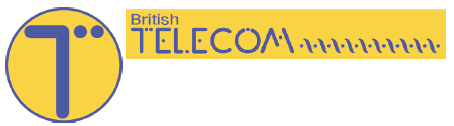
Figure 10
The piper is a symbol of communication in Figure 11, so they were telling the public that this is their main area of expertise. The colours are symbolic of Britain, so they always realise that they need to stay true to where they come from, even though at this time, they were looking to become more of a multinational company.
Figure 11
As BT developed, they looked to expand the areas in which they offered services. This meant that to stay ahead and cement their place as market leaders they would have to give customers something other than telecommunications. As a result of this they rebranded themselves and their values to include the new services that they would offer, namely internet connectivity. In 2003 they changed their piper symbol to a globe symbol (Figure 12.), which is meant to represent a connected world. ('The historical development of BT', n.d.)
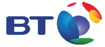
Figure 12
According to BT, the new corporate identity...“Reflects the aspirations of a technologically innovative future, the connected world symbol is bright, strong and clear and embodies BT's five corporate values. The values of Trustworthy and Helpful are long-standing BT service values and are supported by forward-looking values of Inspiring, Straightforward and Heart.” ('The historical development of BT', n.d.) Whether the logo represents all these qualities is questionable, but it does send a clear message of the services that BT offer and what the consumer can achieve if they use this company. They offer the BT Openworld service currently which, together with the logo paints a very positive picture of the service for the customer. It almost says 'The world is open for you to explore with our help.’
BT seems to use their logo to tell the customers about the services that they offer, or areas that they have expertise in. The first logo they had didn't need to be anything special or even appeal to people. At this time they had no competition so they merely had to be a name and a face for a public sector company. As soon as they became privatised though, various acts were passed making sure that there could be healthy competition for the telecommunications industry. This meant that BT had to sell themselves to the consumer, hence the condensing of the name and the symbolic logo. The logo at this time was used to say to people 'this is what we do, we can help you communicate.' Gain, when they rebranded themselves in 2003 they were saying, 'we can now help you communicate globally‘.The strongest part of the BT logo is that they can communicate the important messages to the customer.
An online survey was conducted into the relationship between brand attributes/messages and how well the public feel they can be related to the brand logo. The survey was completed by over 100 people between the ages of 18 and 40. The data has been collected together and synthesised into a number of graphs to illustrate the results.
The survey was taken by 105 people over a period of 3 days online, at esurvey.com. The majority of people who took the survey were between the ages 18 and 25. The results show that on the whole people do agree with the attributes stated for each company's logo.
The results are very mixed for the Pepsi logo. Most people agree that the logo is cool and fashionable, with 57% and 43% selecting this option. For the inspiring attribute only 11% of people agree with this statement, with the majority of the participants disagreeing it is inspiring. The trendsetting attribute also has an even spread between disagree, neutral and agree, with agree just winning with 32%.
For Pepsi, the two most important messages that they are trying to convey are that they are cool and fashionable. The results of this survey back this up.
The results for BT show generally people agree that the brand attributes are shown in the logo Figure 4. The only attribute that people aren't sure about is inspiring. 37% of people said that they neither agreed nor disagreed that the logo was inspiring.
The results for the Apple logo show that that most people either agree or strongly agree that the brand attributes are present in the logo Figure 5. The innovative and savvy traits received 53% and 49% respectively, while the simplicity value received 48% votes under the strongly agree view. 49% of people agreed that the quality attribute was present in the logo, suggesting that Apple represents its brand values successfully through the logo.
Kleenex also showed that they represent brand values well through their logo. Over 50% of people agreed that the logo represented approachable, friendly and family, while 44% of people agreed that the uplifting attribute was visible in the logo.
The results for the Shelter logo are strong for the agree response, but a lot of people have also gone for a neutral response. The approachable attribute received 36% of the neutral vote, followed closely by agree with 35%. The other attributes such as serious and goal orientated received 42% and 37% respectively under agree. Honest was the most concrete attribute with 50% of people feeling that they agreed with the statement.
The intention of this section is to bring together all of the research done to discuss the main aim of the study. The survey results, the information gathered from the case study as well as the opinions and knowledge gained from the literature will help to answer the research question.
There are several ways messages can be conveyed to the public through logos. The symbols and the associations that are made with them is the main method used as well as the use of text in the logotype. The use of symbols in logos is extremely popular. Most logos have some sort of symbol as they can be instantly recognisable and associated with the company. The symbol doesn't have to mean anything, take the Nike logo for example. (Figure 13.) The 'swoosh' symbol doesn't have any symbolic meaning or association; it was designed to be implying movement but it isn't the first thing that springs to mind. Regardless of this, the Nike logo is so recognisable that they don't even need to include the name of the company on the logo.
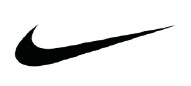
Figure 13
On the other hand, symbols can be used to great effect to convey messages to the public, but it mostly depends on what that message is. For example, if a company wants to make it clear what they do or the services they offer, using a symbol in their logo will help them in delivering this message. A good example of this is the TimeWarner cable logo (Figure 14.). TimeWarner cable is a cable TV group in America and they utilise an eye-ear pictogram as their logo. This essentially tells the consumer that they are an audio visual company. This logo does two of the most important things for a logo: it gives a message and becomes recognisable.
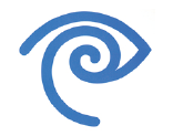
Figure 14
Michael Evamy, the author of the Logo book, talks about what logos mean in the introduction of his logo compendium. He says that 'To read more into a logo, you need to look at the choice of typeface, its weight, the character spacing, the relative position of words and the content and visual style of the symbolic elements'. (Evamy 2007:14) The use of typography is the most common way for organisations to place meanings and messages into their logos. There are many different elements that make up typography as a whole, which means placing messages into logos becomes easier.
Typography is a good way of placing certain brand attributes and values into logos. Companies can use fonts which have certain qualities, to represent the same qualities in their logos. For instance, banks tend to use clear, serious looking fonts to convey the message that they are serious about looking after the customer's money. Both HSBC and Lloyds TSB (Figure 15.) are examples of banks that currently use typography to convey this message. Both use a serif font when placing their name on the logo alongside a symbol.
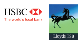
Figure 15
It would be foolish to overlook possibly the greatest piece of typography in a logo, that of the Coca-Cola logo (Figure 16.). Coca-Cola have established themselves as the number one biggest brand in the world and one of the contributing factors to this is their logo.
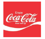
Figure 16
The typeface used is reminiscent of the way that people used to write in the late 19th century which gives it an authentic feel. This is maybe why it is so popular still; people feel they can trust it as they have grown up with it, and generations before them have grown up with it. The logo hasn't changed over all this time as well, which helps the public build up such a strong loyalty to them. In a way, many of the messages that the logo tries to convey are all to do with sentimental attachments, and rely on the consumer building a relationship to them. One of the most interesting and effective ways of using text to carry meaning is to create a wordmark. The wordmark relies on the text to almost become a symbol, or create an expression. By combining the font face, style, size and weighting as well as using characteristics of the letters used, it becomes an effective option. Some prime examples include the Shelter logo (Figure 2.) and the Kleenex logo.
Shelter is a charity focussing on housing issues across the country. They need to express certain qualities in their logo so that people will feel comfortable to approach them for their services. Some attributes the logo needs to represent are: approachable, serious, honest and goal orientated. To achieve this, the designer has used a sans font, medium weighted, to spell out the name of the organisation. This immediately gives a serious, uncomplicated and forthright message to the public. The text is coloured red which makes people more alert, so makes them take notice. The clever part of the logo, which helps to make the organisation so approachable, is the way the 'H' has been made to symbolise a house. This does two things; it gives a small insight into the nature of the charity, and makes the user think of home, and everything homely. This is both extremely simple, and highly effective.
The effectiveness of a logo is heavily connected to the branding methods and marketing of a company. The logo, the identity and the branding are all so inextricably interlinked that they can't function without each other. It is widely accepted that just because a company has a good logo, it doesn't automatically mean that the brand will be a success.
Debbie Millman from Sterling brands says 'It is not necessarily having a type or mark that is critical, it is the marketing and the positioning of the brand with the logo that gives it its power of recognition, and, ultimately, its success'. (Evamy, 2007:28) The logo and the brand often interchange with the messages they are conveying. It is accepted that the logo can help to enhance a brand and give that brand a certain quality, i.e. a serious looking logo can make the company seem serious. It can, and often does, work the other way round. A company can operate in such a way, and build a relationship with the consumer, that when they see the logo they immediately associate certain qualities with the logo.
A good example of this is the BT logo. They have been quoted as saying the logo reflects certain qualities of the brand such as trustworthy and helpful ('The historical development of BT', n.d.). These qualities are hard to place in a logo or even and image, but people still think the logo has these qualities. This is where the line between the logo and the brand begins to blur. BT certainly is a trustworthy and helpful company, they have an excellent reputation for customer service and their products and services are generally reliable. It would not be a surprise if the people who think the logo has these qualities are either customers with BT, or have heard about these qualities that they have.
The opinion of branding experts tends to be critical or sceptical of the importance that is sometimes placed on the logo. They often regard the branding and marketing strategy of the company as more important than the logo. The logo, from their point of view is just the visual face of the company and all it has to do is be recognisable. Evamy (2007:13) questions whether it makes a difference what the logo looks like 'Does this mean that it doesn't matter what a logo looks like...pretty much. However, the best signs are highly visible, communicating quickly and clearly'.
There is a middle ground to be found when comparing the views of designers and branding experts. Designers will crave to produce high quality work with plenty of meaning and artistic value, while branding experts will want to enhance the company the best way they can. It would be foolish to say that a logo can change a brand, but if used in the correct way, they can certainly enrich the brand and help to build a successful image for the company.
There are many reasons why a company might want to change their logo. Michael Evamy (2007:13) discusses this in Logo. 'There are plenty of reasons for a change, a change of name being an obvious one. It may be that a company has outgrown its logo-the design has become misleading about the company's range of activities or simply looks dated'.
Logo designers are now coming round to the idea that the life cycle of logos and identities is becoming much shorter. Michael Johnson (Adams 2008:117) states 'Obviously a faster turnover is good for business and implies that identity design can be more of now and less classic'. They, like all designers strive for their work to become timeless or classic, so you would never need to change it or update it. Famous logos that have never really changed over their brand's life include logos such as Nike, Coca-Cola and Kelloggs. The trend of logos having a shorter shelf life is perhaps down to the methods and techniques used to create them now. In the past, logos had to be reproduced using methods such as printing presses. This meant that the logos had to be fairly simple in terms of detail and colour. With the shift towards using computer software to create the designs, and the advent of more advanced printing methods, more effects can be applied to the logos. 3D effects and colour gradients are now possible and add a new dimension to the logos.
These new effects can also have an adverse effect on the design. They can often create a very modern or 'now' look to the logos, but it also dates them. By this, it means that the time period that they have been designed in can be easily identified, and in this case, they will be identified as st a 21 century logo (Adams, 2008: 117). The use of these effects also goes in and out of fashion, and can often be seen as a fad or a trend. The result is that they can look old or dated easily. This is what ultimately will give the logo a much shorter lifespan as they will need to be updated more often, to keep up with current trends.
This becomes academic if the logo is doing its job. If it is highly recognisable and presents the brand's message clearly then it isn't a big issue. The only playoff is that the consumer may find it harder to build up a relationship with that brand. As long as the brand itself works hard at their relationship with the customer then they can change their logo as many times as they like.
The survey was intended to discover whether the public can pick up on certain messages that companies try to convey to them using their logo. The expectation before the survey was conducted was that the public can generally pick up on these messages, but the survey confirmed this. In the case of most of the logos, all the results showed that the public agreed that the brand attributes specific to that company were represented in their logo. Some notable exceptions were Pepsi and BT, but this was only with a few of their attributes.
One thing to take into consideration is that most of the companies used are established and already easily recognisable for the people taking part in the survey. This means that they could have preconceived ideas about the brand already, and won't take into account how the values match the logo. Take the BT logo for example. One of the values that BT themselves think it embodies is helpfulness. It's difficult to say if the logo represents helpfulness, but the participants of the survey may have had dealings with them and found them to be helpful. Therefore, when they see that logo they may be influenced by this. BT probably won't mind this too much. This is the sign of a strong brand, the fact that the logo is now being associated with that quality due to the way they deal with customers. This goes to reinforce the point that branding is more than a good logo, but a combination of it all.
The aim of the case study was to try to discover why companies change their logos, and whether this has anything to do with the messages they are trying to send out. The study showed that all of the companies had changed their logo because of a need to express a new or different message to the public. Apple tends to use their logo to tell the consumer about any major changes to their products. Some examples are the multi-coloured logo they used for when they introduced colour screen displays to their computers. The brushed aluminium logo is used at the moment to show one of the major design features inherent in their current product ranges. Pepsi on the other hand use their logo as a way to keep themselves perceived as 'cool' and 'trendy' to the current youth generation. This is one of the main reasons why they change their logo and identity so often, as fads and fashion changes so regularly.
BT has changed their logo as the range of services they offer has changed. They have been able to establish a strong brand loyalty over the years so they feel they don't need to tell the consumer that they offer telecommunications services, this is something everyone takes as a given. As they focus more on the internet and broadband services they offer, they include this in the logo, by using the connected globe symbol.
Designers often talk about designing something that is classic and timeless. This is the same in logo design but it is rare. As times and businesses change, so do the messages and values. As the logo is the focal point of every business it is important that it gives the right message to the consumer, whether this be about the products and services they offer or what they believe in and stand for.
One of the main limitations that has possibly held the study back is the amount of people available to take part in the survey. The main aim of the study was to determine whether the public can ascertain messages and meanings behind logos. For this to be a true reflection of public opinion a large number of people have to participate, a thousand upwards. With only having just over a hundred people take the survey, it's difficult to say that the results are indicative of what the public think.
To follow up this study it may be a good idea to look further into the intricacies of typography, delving deeper into the variety and use of different fonts. Typography is a whole separate art form that this study has only scratched the surface of. Further research could be done into branding and marketing as this is linked so heavily with the logo. Branding has only briefly been looked at and by gaining a greater amount of knowledge, it could help to gain a better understanding of the effective use of the logo. Symbolism could be an interesting area to study, as this could then be used to analyse certain logos to discover if they hold any specific meanings.